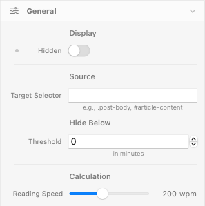
General
Display
Hidden
- Description: Hides the entire ReadTime component. Useful for responsive scenarios where the badge should appear only on certain breakpoints.
- Default: false (visible)
- Responsive: Yes
Source
Target Selector
- Description: CSS selector that points to the element containing your article text. ReadTime reads the rendered text content of the targeted element, counts words, and displays the calculated reading time.
- Examples:
#article-body,.post-content,article.main - Default: empty — required to be set before publishing
- Responsive: No
Notes:
- If the selector doesn't match any element on the page, the badge is hidden automatically.
- If multiple elements match, only the first is used.
- The badge updates once on page load — re-renders are not currently supported, so don't use this on dynamically-loaded content.
Hide Below
Threshold
- Description: Minimum reading time in minutes below which the badge hides itself. Useful to prevent "1 min read" clutter on short content like FAQs or summary cards. Set to 0 to always show the badge regardless of length.
- Default: 0 (always shown)
- Responsive: No
Calculation
Reading Speed
- Description: Average reading speed in words per minute (wpm) used to calculate minutes from word count. The standard average is around 200 wpm; adjust lower for technical or code-heavy content (≈150 wpm), higher for list-style or scannable content (≈250 wpm).
- Default: 200 wpm
- Responsive: No
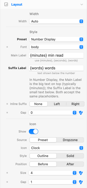
Layout
Width
Width
- Description: Sizing of the ReadTime wrapper in your layout.
- Options: Auto, Full
- Default: Auto
- Responsive: Yes
Alignment
- Description: Horizontal alignment of the badge inside the wrapper. Visible only when Width is Full and the preset is not Number Display.
- Options: Start, Center, End
- Default: Start
- Responsive: Yes
Style
Style Preset
- Description: Visual starting point for the badge. Each preset is a complete combination of background, text, padding, border, radius, and shadow. The Override switches in the Styles group let you take over individual properties without losing the rest of the preset.
- Default: Pill Soft
- Responsive: No
The five presets:
- Pill Soft: rounded pill, soft gray background, subtle shadow. The default.
- Pill Outlined: rounded pill, transparent background, gray border. Quieter alternative.
- Inline Text: no container, just text with optional icon. For headers where a badge would be visually heavy.
- Bold Badge: solid blue background, bold white text, rounded square. Prominent.
- Number Display: two-line stack with large minutes number and small suffix label below. Editorial / magazine layouts.
- Custom: minimal base styling, intended to be fully customized via the Styles group overrides.
Format
Format Preset
- Description: Text format for the badge. Supports
{minutes},{seconds}, and{words}placeholders. Pick a preset or write your own. - Examples:
{minutes} min read,{minutes}:{seconds} reading time,{words} words · {minutes} min - Default:
{minutes} min read - Responsive: No
Localization tip:
To localize the badge, edit the format string directly: {minutes} min de lecture (FR), {minutes} min di lettura (IT), Lectura: {minutes} min (ES). The placeholders are language-agnostic.
Number Display Format
Main Label
- Description: Format string for the prominent line of the Number Display preset. Supports the
{minutes},{seconds},{words}placeholders — typically used to render the big number. Visible only when Style Preset is Number Display. - Default:
{minutes} - Responsive: No
Suffix Label
- Description: Small label rendered next to (or below) the number. Supports the same
{minutes},{seconds},{words}placeholders as the Main Label, so the two labels can split or share tokens freely. Visible only when Style Preset is Number Display. - Examples:
min read,{words} words,read · {minutes} min - Default:
min read - Responsive: No
Gap
- Description: Spacing between the Main Label and the Suffix Label of the Number Display stack. Applies as vertical gap when the layout is stacked (Inline Suffix = None) or as horizontal gap when the layout is inline (Inline Suffix = Left/Right). Theme spacing primitive, single mode. Visible only when Style Preset is Number Display.
- Default: 0 (labels sit flush)
- Responsive: Yes
Inline Suffix
- Description: Places the Suffix Label beside the Main Label instead of below it, when the Style Preset is Number Display. Three options: None (default — stacked vertical), Left (suffix to the left of the main label), Right (suffix to the right of the main label). Both labels remain vertically centered with each other when inline.
- Default: None
- Responsive: Yes — different layouts per breakpoint (e.g. stacked on mobile, inline on desktop).
Icon
Show Icon
- Description: Toggle the icon on or off. When off, the badge shows text only.
- Default: true
- Responsive: Yes
Icon Source
- Description: Where the icon comes from. Preset uses the built-in Heroicons; Dropzone lets you place any element you want.
- Options: Preset, Dropzone
- Default: Preset
- Responsive: No
Icon (Preset)
- Description: Selects one of six built-in Heroicons. Visible only when Source is Preset.
- Options: Clock, Book Open, Document Text, Eye, Sparkles, Bookmark
- Default: Clock
- Responsive: No
Icon Style, Position, Size, Gap
- Style: Outline or Solid (Heroicons variants).
- Position: Before or After the text.
- Size: Theme spacing primitive — produces width and height classes from the theme scale.
- Gap: Theme spacing primitive — gap between icon and text.
- Responsive: Size and Gap support responsive values.
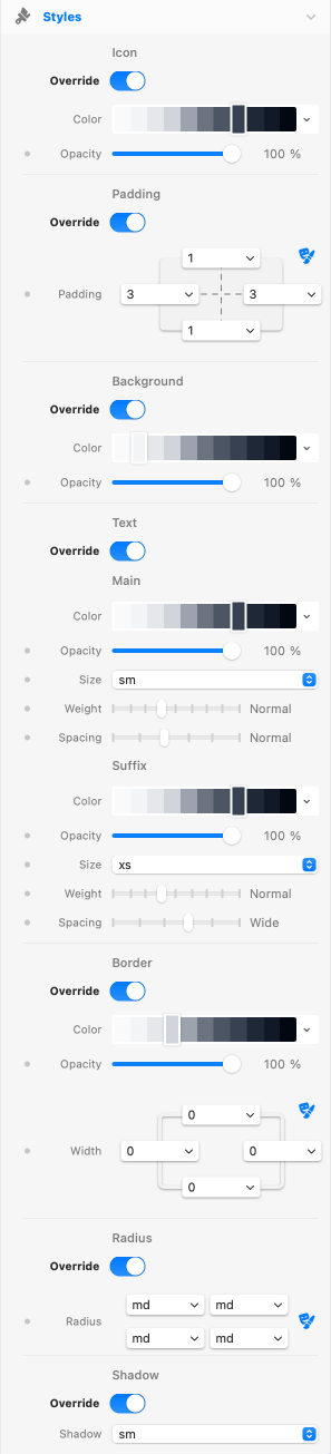
Styles
The Styles group is built around a preset-plus-override pattern. Each subgroup (Icon, Padding, Background, Text, Border, Radius, Shadow) has an Override switch. When off, the preset's value stays in charge. When on, your override takes over with full theme integration.
Icon Color
Override Icon Color
- Description: When on, the icon color is taken from the override (theme color + opacity, both responsive). When off, the icon inherits
currentColorfrom the surrounding text. - Default: false (inherits text color)
- Responsive (Color/Opacity): Yes
Padding
Override Padding
- Description: Padding inside the badge wrapper. Uses the theme spacing primitive (responsive, link H/V).
- Default: false (preset padding kept)
- Responsive: Yes
Background
Override Background
- Description: Background color and opacity for the badge wrapper. Uses the theme color primitive plus a CSS variable for opacity (R1-bis pattern), allowing both color and opacity to vary per breakpoint.
- Default: false (preset background kept)
- Responsive (Opacity): Yes
Text
Override Text
- Description: Text color, opacity, size, weight, and letter spacing. Size uses theme text style; weight and spacing are sliders. In Number Display mode, the override applies to the large number line, and a dedicated Suffix subgroup exposes the same five controls (Color, Opacity, Size, Weight, Spacing) for the small label below — each line has fully independent typography and color.
- Default: false (preset typography kept)
- Responsive (Color, Opacity, Size, Weight, Spacing): Yes — for both the main text and the suffix subgroup independently.
Border
Override Border
- Description: Border color, opacity, and width. Width uses the theme border width primitive (responsive, link H/V).
- Default: false (preset border kept)
- Responsive (Opacity, Width): Yes
Radius
Override Radius
- Description: Border radius for the four corners of the badge wrapper. Uses the theme border radius primitive.
- Default: false (preset radius kept)
- Responsive: No
Shadow
Override Shadow
- Description: Box shadow preset for the badge wrapper. Uses the theme shadow primitive. Applied as inline style to ensure the override always wins over preset classes.
- Default: false (preset shadow kept)
- Responsive: No
Accessibility
ReadTime ships with an ARIA label on the wrapper that exposes the full reading-time text to screen readers — including the suffix in Number Display mode (so screen readers announce "8 min read" rather than just "8"). No configuration required.
If the badge is hidden because the article is below the minimum threshold, no ARIA content is announced.
Credits
Built-in icons are Heroicons by the makers of Tailwind CSS, MIT licensed.
See Also
SmartLine component — the natural companion for blog post sections. Adds a thin progress line above the article tracking how far the reader has scrolled, complementing the upfront "5 min read" badge.