Hi, I’m Float!
Float, contextual content on demand
Tooltips, popovers, hover previews, confirmations — anything that should appear next to a trigger, smartly positioned and beautifully animated.
Hi, I’m Float!
Tooltips, popovers, hover previews, confirmations — anything that should appear next to a trigger, smartly positioned and beautifully animated.
A few common patterns. The flexibility of Float covers many more.
Brief explanations on hover. Smart auto-positioning flips the popover when there's no room near a viewport edge.
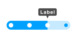
Click an info button to get clarification. Stays open until dismissed.
Hover a name or avatar to reveal a rich preview, with delay so it doesn't trigger by accident.
Action menus from a kebab icon. Click outside to close.
"Saved!" messages that disappear on their own. Pause on hover keeps them visible while reading.
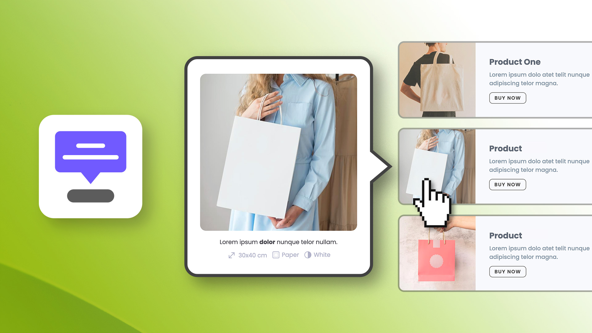
Multiple hotspots on an image, each with its own popover.
Always in view, always pointing at the trigger.
Top, bottom, left, right with start, center, or end alignment along the cross axis. Eight combinations to fit any layout.
Float flips to the opposite side when near a viewport edge, and shifts along the cross axis to stay in view. No manual breakpoint juggling.
The arrow always points at the actual trigger, even when auto-positioning has shifted the popover off-center.
Pick the interaction that fits your use case — works on desktop and mobile without extra setup.
Toggle the Float open and closed. Persistent until the user dismisses it.
Opens on mouseenter, closes on mouseleave. Configurable show and hide delays. Hovering the popover keeps it open.
Hover shows a preview, click locks it open. While locked, hovering another trigger re-anchors the Float without unlocking.
Stay open or close on a timer — your call.
The Float stays until the user clicks outside, presses ESC, clicks the trigger again, or moves the cursor away. Each dismissal mode is independently togglable.
Auto-close after a configurable delay in milliseconds. Pause on hover keeps it visible while the user is reading, resumes the timer on mouseleave.
Six animations and per-breakpoint control over every visual property.
Fade, Scale, Slide Up, Slide Down, Slide Left, Slide Right. Configurable duration. Same animation runs in reverse on close.
Color, opacity, and size. Borders inherit from the popover for a unified outline. The caret stops at the start of the rounded corner radius so it never visually detaches from the popover edge.
Auto-fit content, match the trigger's width or height (great for caption-style overlays or full-cell image grids), or pick a theme spacing token.
Background, border (color + opacity + width), padding, opacity, caret size — every visual property has its own value per breakpoint.
Wrap your trigger, or attach to anything on the page.
Drop your trigger element (button, icon, image, anything) inside the Float component. The most common case.
Attach the Float to any element on the page via a CSS class — without nesting it inside the component. Multiple elements can share the same class — they all open the same Float, anchored to whichever was triggered.
Add a class to any element anywhere on the page (footer link, navbar shortcut, sidebar button) and clicking it opens the same Float — which stays anchored to its main trigger. One popover, multiple entry points across the page.
Tooltips, hover previews, action menus, confirmations, annotations — see how a single component covers all the patterns of contextual content.

Demo project file included
Everything you need to know about the Float component.
Tooltips, popovers, and hover previews — anchored to any element on your page.
Discover our components for Elements and take your page design to the next level.
Float, contextual content on demand
© RW Pro Space • All rights reserved