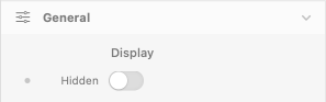
General
Display
Hidden
- Description: Hides the entire Float component (trigger + popover). Useful for responsive scenarios where the Float should appear only on certain breakpoints.
- Default: false (visible)
- Responsive: Yes
Trigger Settings
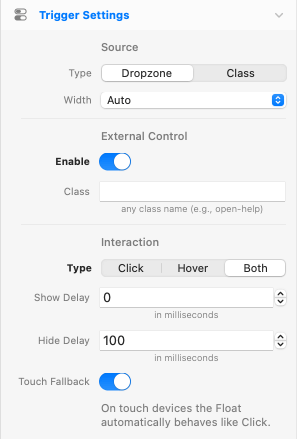
Source
Source
- Description: How the trigger element is sourced.
- Options: Dropzone, Class
- Default: Dropzone
- Responsive: No
Notices:
- Dropzone: Place the trigger element directly inside the Float's Trigger dropzone. The Float wraps the trigger and anchors next to it.
- Class: Attach the Float to any existing element on the page via a CSS class. The Float lives elsewhere in the DOM and projects to the targeted element(s) at runtime.
Width
- Description: Sizing of the Float wrapper in your layout.
- Options: Auto, Full
- Default: Auto
- Responsive: No
- Availability: Only when Source is Dropzone
Notices:
- Auto: Float shrinks to fit the trigger content (typical popover behavior).
- Full: Float occupies the full parent width. Trigger content (e.g., a Button) auto-stretches when its left/right margins are 0, or auto-centers when margins are set to Auto. The popover anchors to the actual visible trigger content, so it always sits next to the Button regardless of where the Button is positioned within the wrapper.
- Tip: for a centered Button with the popover sized to its width, wrap Float (Width = Auto) inside a Container with center alignment instead of using Width = Full.
Trigger Class
- Description: The CSS class name to add to elements you want to turn into triggers (e.g.
my-trigger). Multiple elements can share the same class. - Default: (empty)
- Responsive: No
- Availability: Only when Source is Class
External Control
Enable
- Description: Allows any element on the page (button, link, icon, etc.) to open this Float on click, in addition to its main trigger. The Float still appears anchored to its main trigger — not next to the external element. Useful for footer help links, navbar shortcuts, or any UI control that should reveal a popover located elsewhere on the page.
- Default: false (disabled)
- Responsive: No
- Availability: Always (works with both Dropzone and Class as Source Type)
Class
- Description: The CSS class name to add to any element you want to act as an external opener (e.g.
open-help). Clicking such an element opens this Float using Click semantics — regardless of the Interaction Type (Hover/Both also fall back to Click for the external opener, because hover triggers across the page would be confusing UX). - Default: (empty)
- Responsive: No
- Availability: Only when External Control → Enable is on
Notices:
- Anchor resolution in Class mode: if multiple elements on the page share the main Trigger Class, the external opener anchors the Float to the first DOM match.
- Multiple Floats simultaneously: a single Float instance can show its popover at one anchor at a time. To open multiple popovers from one external click, place several Float components on the page sharing the same Trigger Class and External Control Class — each instance reacts independently and opens at its own anchor.
- Cursor: external opener elements automatically receive
cursor: pointer. - Click-outside: external openers are excluded from the click-outside dismiss listener — clicking one opens (or toggles) the Float without immediately closing it.
Interaction
Type
- Description: How the user opens the Float.
- Options: Click, Hover, Both
- Default: Click
- Responsive: No
Notices:
- Click: Tap or click the trigger to open. Click outside, press ESC, or click the trigger again to dismiss (each behavior individually configurable).
- Hover: Open on mouse enter, close on mouse leave. Best for tooltips.
- Both: Hover previews the Float; click locks it open until manually dismissed.
Show Delay
- Description: Delay before the Float opens after the cursor enters the trigger.
- Default: 0ms
- Range: 0 – 2000ms
- Responsive: No
- Availability: Only when Type is Hover or Both
Hide Delay
- Description: Delay before the Float closes after the cursor leaves the trigger. A small delay (~100ms) gives the user time to move the cursor onto the popover without the Float disappearing.
- Default: 100ms
- Range: 0 – 2000ms
- Responsive: No
- Availability: Only when Type is Hover or Both
Touch Fallback
- Description: On touch devices the Float automatically behaves like Click, regardless of the configured Type. Hover and Both modes rely on mouseenter/mouseleave events that don't fire reliably on touch input — without this fallback, tapping a Hover-mode trigger would briefly show the Float and then immediately hide it because the synthetic mouseleave fires right after the tap. With the fallback on, tap opens, tap-again (or tap outside) closes — the same behavior as Click mode.
- Default: true (enabled)
- Responsive: No
- Availability: Only when Type is Hover or Both
- When to disable: Only on kiosk or hybrid hardware where you want hover behavior to apply even on touch input. For typical web use, leave it on.
Float Layout
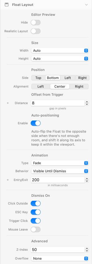
Editor Preview
Hide
- Description: Hides the Float's content area in the editor preview to save vertical space on the page. The popover renders normally at runtime.
- Default: false (disabled)
- Responsive: No
Realistic Layout
- Description: Editor preview uses absolute positioning so the trigger keeps its real size and the popover floats to the configured Side. Affects editor only — runtime is unchanged.
- Default: false (disabled)
- Responsive: No
Notice:
In nested grid/Container layouts, the popover preview overlays adjacent items only when overflowing toward earlier DOM siblings (typically Side = Left or Top). For Side = Right/Bottom in such layouts, the popover may be hidden behind the next item. Disable Realistic Layout (or enable Hide) for those Floats.
Size
Width
- Description: Width sizing of the Float popover.
- Options: Auto, Match Trigger, Theme Spacing
- Default: Auto
- Responsive: No (Theme Spacing field is responsive)
Height
- Description: Height sizing of the Float popover.
- Options: Auto, Match Trigger, Theme Spacing
- Default: Auto
- Responsive: No (Theme Spacing field is responsive)
Notices:
- Auto: popover sized to its content (default).
- Match Trigger: popover dimension equals the trigger's dimension. Width and Height are independent — set one or both. Useful for caption-style popovers (Width = Match Trigger) or full-cell overlays in image grids (Width = Match Trigger AND Height = Match Trigger).
- Theme Spacing: fixed dimension from your theme's spacing scale (responsive per breakpoint).
Position
Side
- Description: Where the Float appears relative to the trigger.
- Options: Top, Bottom, Left, Right
- Default: Bottom
- Responsive: No
Alignment
- Description: Alignment of the Float along the chosen Side.
- Options: Left / Center / Right when Side is Top or Bottom; Top / Middle / Bottom when Side is Left or Right
- Default: Center / Middle
- Responsive: No
Offset from Trigger
Distance
- Description: Gap in pixels between the Float and the trigger.
- Default: 8px
- Range: 0 – 50px
- Responsive: Yes
Auto-positioning
Enable
- Description: Auto-flips the Float to the opposite Side when there's not enough room, with a perpendicular-side fallback if both primary-axis sides are blocked. Also shifts it along its axis to keep it within the viewport.
- Default: true (enabled)
- Responsive: No
Trigger visibility tracking:
When the trigger scrolls out of the viewport, the Float is automatically hidden — without firing a dismiss. When the trigger scrolls back into view, the Float reappears anchored to its new on-screen position. The open state is preserved throughout, so the user's intent is respected.
Viewport Scroll Offset
Top
- Description: Space to keep clear at the top of the viewport, e.g., to leave room for a sticky header. The Float popover stops at this distance from the top instead of clamping to the viewport edge.
- Default: 0px
- Range: 0 – 200px
- Responsive: Yes
- Availability: Only when Side is Left or Right
Bottom
- Description: Space to keep clear at the bottom of the viewport, e.g., to leave room for a sticky footer.
- Default: 0px
- Range: 0 – 200px
- Responsive: Yes
- Availability: Only when Side is Left or Right
Notice:
Top and Bottom offsets serve a dual purpose: they prevent the popover from clamping under sticky chrome, AND they shrink the trigger's effective viewport so the Float hides earlier when the trigger crosses into the offset zone (rather than waiting for it to fully exit the viewport).
Animation
Type
- Description: Visual animation applied on entry and exit.
- Options: Fade, Scale, Slide Up, Slide Down, Slide Left, Slide Right
- Default: Fade
- Responsive: No
Behavior
- Description: How the Float closes after opening.
- Options: Visible Until Dismiss, Hide After Timeout
- Default: Visible Until Dismiss
- Responsive: No
Notices:
- Visible Until Dismiss: The Float stays open until the user dismisses it (Click Outside, ESC, Trigger Click, or mouse leave in Hover mode).
- Hide After Timeout: The Float auto-closes after a configurable delay. Useful for transient notifications.
Entry/Exit
- Description: Duration of the entry and exit animations.
- Default: 200ms
- Range: 0 – 1000ms
- Responsive: Yes
Timeout
- Description: Time before the Float auto-closes. The countdown starts after the entry animation completes, so the popover stays fully visible for the full timeout duration.
- Default: 2000ms
- Range: 100 – 30000ms
- Responsive: No
- Availability: Only when Behavior is Hide After Timeout
Pause on Hover
- Description: Pauses the auto-close timer while the user hovers the Float, and resumes it when the cursor leaves.
- Default: true (enabled)
- Responsive: No
- Availability: Only when Behavior is Hide After Timeout
Start Open
Enable
- Description: Renders the Float already open on first paint. Useful for onboarding hints or default-visible states.
- Default: false (disabled)
- Responsive: No
- Availability: Only when Source is Dropzone and Type is Click
Dismiss On
Click Outside
- Description: Closes the Float when the user clicks anywhere outside the popover and the trigger.
- Default: true (enabled)
- Responsive: No
ESC Key
- Description: Closes the Float when the user presses the ESC key.
- Default: true (enabled)
- Responsive: No
Trigger Click
- Description: Closes the Float when the user clicks the trigger again.
- Default: true (enabled)
- Responsive: No
Mouse Leave
- Description: Closes the Float when the cursor leaves both the trigger and the popover, after the configured Hide Delay. Brings hover-style auto-dismiss to click-based interactions — useful for click-to-open menus or tooltips that should close when the user moves away, without requiring an explicit dismiss action. In Both mode it overrides the click-locked state, so moving the cursor away closes a Float that was opened (and locked) by click.
- Default: false (disabled)
- Responsive: No
- Availability: Only when Type (Trigger Settings → Interaction) is Click or Both. In Hover mode this behavior is built-in.
Advanced
Z-Index
- Description: Controls the stacking order of the Float popover. Increase if the popover appears behind other elements like sticky headers, modals, or fixed overlays.
- Default: 50
- Range: 0 – 9999
- Responsive: No
Overflow
- Description: How content that exceeds the Float bounds is handled.
- Options: None, Visible, Hidden, Scroll, Auto
- Default: None
- Responsive: No
Notice:
With Hidden, Scroll, or Auto the Caret is clipped because it sits outside the Float edge.
Float Styles
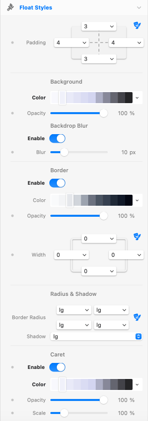
Padding
Padding
- Description: Inner padding of the Float popover, per side.
- Default: 3 / 4 / 3 / 4 (top / right / bottom / left)
- Responsive: Yes
Background
Color
- Description: Background color of the Float popover.
- Default: white-500
- Responsive: No
Opacity
- Description: Opacity of the Float background color.
- Default: 100%
- Range: 0 – 100%
- Responsive: Yes
Backdrop Blur
Enable
- Description: Applies a Gaussian blur to whatever sits behind the Float. Pairs well with a translucent background.
- Default: false (disabled)
- Responsive: No
Blur
- Description: Blur radius in pixels.
- Default: 10px
- Range: 0 – 50px
- Responsive: Yes
- Availability: Only when Backdrop Blur > Enable is on
Border
Enable
- Description: Adds a border around the Float popover. The Caret inherits the border on its outer edges, so the outline stays continuous.
- Default: false (disabled)
- Responsive: No
Color
- Description: Border color.
- Default: gray-200
- Responsive: No
- Availability: Only when Border > Enable is on
Opacity
- Description: Opacity of the border color.
- Default: 100%
- Range: 0 – 100%
- Responsive: Yes
- Availability: Only when Border > Enable is on
Width
- Description: Border width per side.
- Default: 1 / 1 / 1 / 1 (top / right / bottom / left)
- Responsive: Yes
- Availability: Only when Border > Enable is on
Radius & Shadow
Border Radius
- Description: Corner radius of the Float popover.
- Default: lg (all corners)
- Responsive: No
Shadow
- Description: Box shadow preset applied to the Float popover.
- Default: lg
- Responsive: No
Caret
Enable
- Description: Shows a small caret (arrow) pointing from the Float toward the trigger. The caret side is automatically opposite to the Float's Side.
- Default: false (disabled)
- Responsive: Yes
Notice:
The Float border, if applied, may show through a transparent caret.
Color
- Description: Caret background color.
- Default: white-500
- Responsive: No
- Availability: Only when Caret > Enable is on
Opacity
- Description: Opacity of the caret color.
- Default: 100%
- Range: 0 – 100%
- Responsive: Yes
- Availability: Only when Caret > Enable is on
Scale
- Description: Size of the caret as a percentage of its base 10×10 pixel dimensions.
- Default: 100%
- Range: 50 – 250%
- Responsive: Yes
- Availability: Only when Caret > Enable is on