Toggler, two worlds with a single click
Let users flip between two content states — pricing, layouts,
before/after, or anything you need — with smooth animations.
Let users flip between two content states — pricing, layouts,
before/after, or anything you need — with smooth animations.
These are just examples — the possibilities are limited only by your imagination.
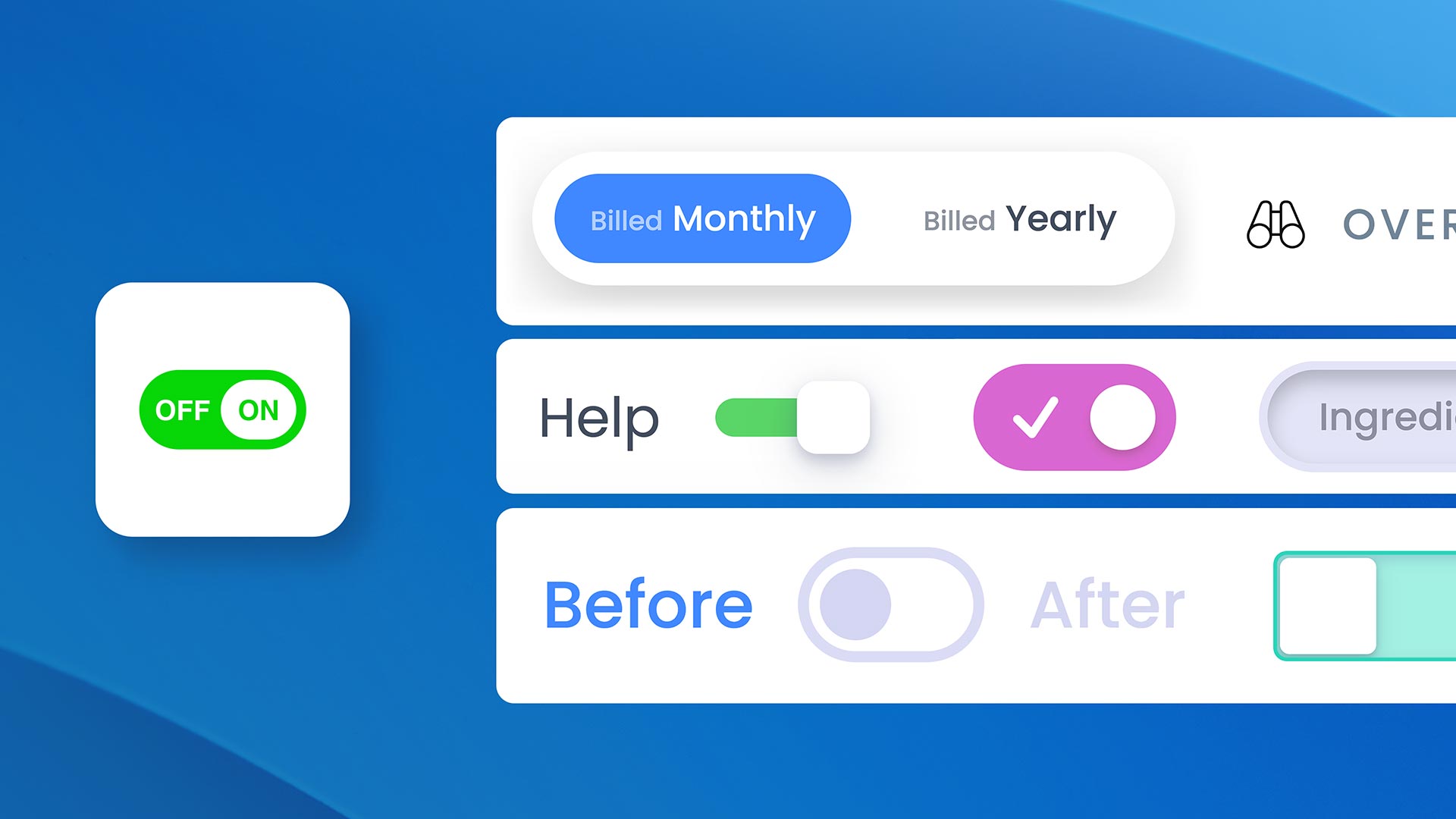
The classic use case. Let visitors switch between billing periods with a clean pill or switch toggle. Persistence remembers their choice across page reloads.
Show two versions of anything — design mockups, photo edits, feature upgrades. Users click to reveal the difference instantly, with a smooth fade or slide transition.
Demonstrate your product or template in both light and dark mode. Visitors toggle between themes directly on the page without leaving.
Switch between "Basic" and "Pro" feature sets. Use CSS Selectors mode to highlight, dim, or scale different elements across the page from a single toggle.
Toggle between two language versions of a section. Combined with persistence, returning visitors see their preferred language automatically.
Let users choose between grid and list views, compact and detailed layouts, or any two presentation styles — all controlled by a single toggle.
Choose the perfect toggle for your design — from minimal labels to fully custom elements.
Pill-shaped buttons inside a rounded container. Supports a smooth sliding background animation that follows the active button. Full control over track, button colors, padding, and border radius.
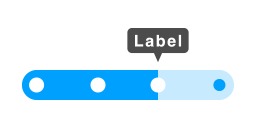
Minimal clickable text labels. Clean and lightweight — just text with active, hover, and default color states. Perfect for inline toggles.
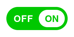
iOS-style toggle with four visual variants: Standard (classic circle handle), Icon (custom SVG or image inside the handle), Inner Text (ON/OFF labels inside the track), and Thin (compact minimal variant). Configurable scale, shape, colors, and shadows per state.
Two dropzone slots where you can place any Elements component as a trigger. Full creative freedom — buttons, images, icons, or entire layouts as toggle controls. Opacity states for default, hover, and active.
Internal dropzones or external CSS targeting — choose how you want to manage content.
Two built-in content areas (A and B) where you drag and drop any Elements component. Content switches with configurable animations: Fade, Slide Horizontal, Slide Vertical, or None.
Target any elements on the page by class or ID. Toggler applies style transitions (opacity, scale, translate, blur, shadow, max-height) to create active/inactive states — without moving content into the component.
In Dropzones mode, the container smoothly animates its height when switching between content of different sizes. No jarring jumps — just fluid transitions.
In CSS Selectors mode, go beyond opacity and scale. Animate translateX, translateY, blur, shadow, and max-height independently for default and active states. Create expand/collapse, slide-in, and focus effects.
The user's choice persists and stays in sync across multiple instances.
The user's last selection is saved to localStorage and automatically restored on page reload. Perfect for pricing toggles or theme preferences.
Set an ID to unlock two capabilities: sync multiple Toggler instances together (toggle one, all update), and target a specific Toggler from utility classes (e.g., toggler-show-a-myID). One field, two uses.
Keep the toggle accessible as users scroll through content.
The trigger sticks to the top of the viewport when the user scrolls past it. Separate styles for the stuck state: background, padding, shadow, border radius, and backdrop blur.
Position the trigger overlapping the content area instead of stacking above it. Control the z-index and fine-tune the offset from left or right edges.
The trigger can have a different alignment when stuck versus its normal position — e.g., centered normally but left-aligned when sticky.
Natural interactions beyond clicking.
On mobile, users can swipe left/right to toggle between Content A and B. A natural touch interaction that complements the visual trigger.
After toggling, the page automatically scrolls to bring the Toggler into view with a configurable offset from the top. Prevents the user from losing their place.
Control Toggler from anywhere on the page. Apply toggler-show-a, toggler-show-b, or toggler-toggle to any element to turn it into a remote trigger. Target all Togglers at once, or a specific instance by appending its Toggler ID (e.g., toggler-show-a-pricing).
See what's possible. Each example demonstrates a different combination of features — from simple pricing toggles to complex multi-element orchestration. Clone any example and make it yours.
Demo project file included
Everything you need to know about the Toggler component.
Give your visitors the power to choose between two worlds with a single click.
Discover our components for Elements and take your page design to the next level.
Toggler, two worlds with a single click
© RW Pro Space • All rights reserved