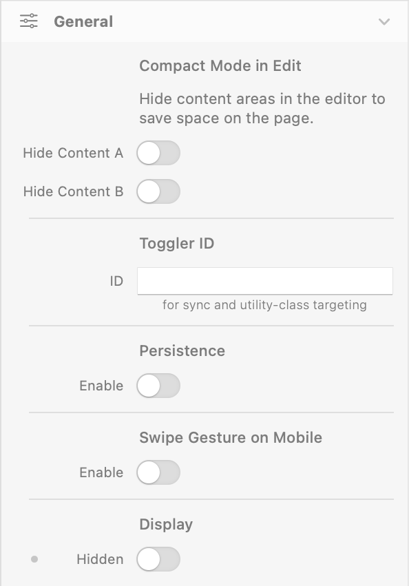
General
Compact Mode in Edit
Hide Content A / Hide Content B
- Description: Hides the respective content area in the editor to save space on the page.
- Default: false (disabled)
- Responsive: No
- Availability: Only when Content Mode is Dropzones
Toggler ID
ID
- Description: Dual-purpose identifier. Use it to: (1) sync multiple Toggler instances together — they will update together when the user interacts with any of them; (2) target this specific Toggler from utility classes (e.g.
toggler-show-a-myID). - Default: (empty)
- Responsive: No
Persistence
Enable
- Description: Remembers the user's last choice across page reloads using the browser's localStorage.
- Default: false (disabled)
- Responsive: No
Swipe Gesture on Mobile
Enable
- Description: Allows users to swipe left to show Content B and swipe right to show Content A on touch devices.
- Default: false (disabled)
- Responsive: No
Display
Hidden
- Description: Hides the entire Toggler component (triggers + content). Useful for responsive scenarios where the Toggler should be visible only on certain breakpoints.
- Default: false (visible)
- Responsive: Yes
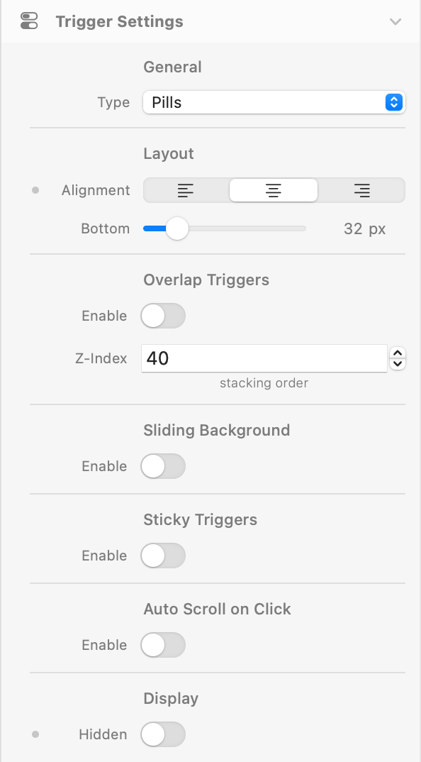
Trigger Settings
Type
- Description: The visual style of the toggle control.
- Options: Labels, Pills, Switch, Custom
- Default: Pills
- Responsive: No
Notices:
- Labels: Simple clickable text labels.
- Pills: Pill-shaped buttons in a rounded container, with optional sliding background animation.
- Switch: iOS-style toggle with 4 visual variants (Standard, Icon, Inner Text, Thin).
- Custom: Two dropzone slots for fully custom trigger elements.
Layout
Alignment
- Description: Horizontal alignment of the trigger.
- Options: Left, Center, Right
- Default: Center
- Responsive: Yes (note: when Overlap Triggers is enabled, JS uses the base value only — responsive variants of Alignment don't apply in overlap mode)
Bottom / Top
- Description: Spacing between the trigger and the content area. Shows as Bottom in normal mode, Top when Overlap Triggers is enabled.
- Default: 32px
- Range: 0 – 200px
Overlap Triggers
Enable
- Description: Positions the trigger overlapping the content area instead of stacking above it.
- Default: false (disabled)
Z-Index
- Description: Stack order of the overlapped trigger.
- Default: 40
- Range: 0 – 9999
Left / Right Offset
- Description: Horizontal offset when alignment is Left or Right.
- Default: 32px
- Range: 0 – 200px
- Availability: Only when Overlap Triggers is enabled and Alignment is Left or Right
Sliding Background
Enable
- Description: Adds a smooth sliding background animation behind the active pill button.
- Default: false (disabled)
- Availability: Only when Type is Pills
Duration
- Description: Duration of the sliding animation.
- Default: 300ms
- Range: 100 – 2000ms
- Availability: Only when Sliding Background is enabled
Sticky Triggers
Enable
- Description: Makes the trigger sticky at the top of the viewport when scrolling past it.
- Default: false (disabled)
- Availability: Only when Overlap Triggers is disabled. Disabled when CSS Selectors mode is active.
Top Offset
- Description: Distance from the top of the viewport when stuck.
- Accepts: Any CSS value —
px,vh,rem,calc(), etc. - Default: 0px
- Responsive: Yes
Alignment (Sticky)
- Description: Alignment of the trigger when in the sticky state (can differ from the normal alignment).
- Options: Left, Center, Right
- Default: Center
Sticky Styles
- Description: Visual properties applied when the trigger is in the sticky state.
- Properties: Alignment (separate from normal alignment), Background color & Opacity (theme color, opacity responsive via CSS variable pattern), Padding (themeSpacing, 4 sides with link H/V), Border Radius, Shadow, Backdrop Filter (Blur, responsive)
- Defaults: Background: white-500, Opacity: 100%, Padding: top/bottom 3, left/right 4 (theme scale), Shadow: none
- Responsive: Padding, Background Opacity, Backdrop Blur
Auto Scroll on Click
Enable
- Description: Automatically scrolls the component into view when the user toggles between A and B.
- Default: false (disabled)
From Top
- Description: Offset from the top of the viewport when auto-scrolling.
- Default: 80px
- Responsive: Yes
- Availability: Only when Auto Scroll is enabled
Display
Hidden
- Description: Hides the trigger controls only (the content area remains visible). When enabled, control the Toggler from external elements via Utility Classes (see Utility Classes section below).
- Default: false (visible)
- Responsive: Yes
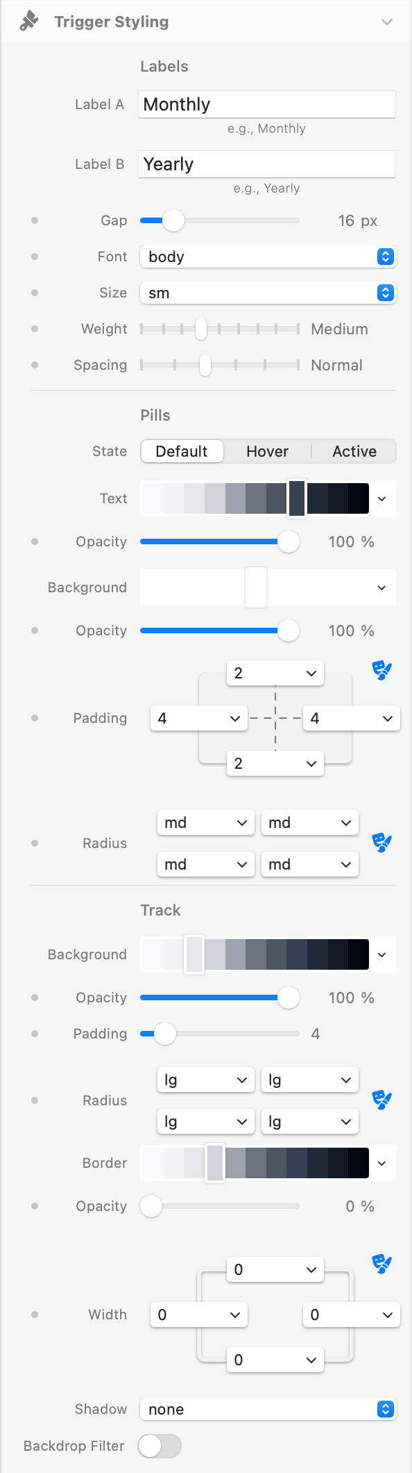
Trigger Styling
Labels
Label A / Label B
- Description: Text displayed on each trigger button.
- Default: "Monthly" / "Yearly"
- Availability: Labels, Pills, and Switch (with labels enabled)
Gap
- Description: Space between trigger elements (themeSpacing).
- Default: 4 (theme scale = 16px)
- Responsive: Yes
Labels Type
Text Styles (Font, Size, Weight, Spacing)
- Description: Typography settings for the Labels trigger type.
- Defaults: Font: body, Size: base, Weight: medium, Spacing: normal
- Availability: Only when Type is Labels
Text Colors (Default / Hover / Active)
- Description: Text color in each state.
- Defaults: Default: gray-700, Hover: gray-800, Active: blue-500
- Availability: Only when Type is Labels
Pills Type
Text Styles (Font, Size, Weight, Spacing)
- Description: Typography settings for the Pills trigger type.
- Defaults: Font: body, Size: sm, Weight: medium, Spacing: normal
- Availability: Only when Type is Pills
Pill Buttons (Default / Hover / Active)
- Description: Each state (Default / Hover / Active) has Text color & Opacity and Background color & Opacity. Plus Padding (themeSpacing, 4 sides) and Border Radius (theme).
- Active state extras: Shadow (themeShadow, default: sm)
- Defaults: Default BG: white-500, Default Text: gray-700; Hover BG: gray-300, Hover Text: gray-800; Active BG: blue-500, Active Text: white-500
- Padding: top/bottom 2, left/right 4 (theme scale)
- Radius: md (all corners)
- Responsive: Padding, all 6 Opacities (Default/Hover/Active × Text/BG)
Track
- Description: The container that wraps the pill buttons.
- Properties: Background color & Opacity, Padding (controls track size around pills), Border Radius, Shadow, Backdrop Filter (Blur)
- Defaults: Background: gray-200, Opacity: 100%, Padding: 4px, Radius: lg, Shadow: none
- Responsive: Padding, Background Opacity, Backdrop Blur
- Availability: Only when Type is Pills
Track Border
- Description: Optional border applied to the Pills track container.
- Properties: Color & Opacity (theme color + responsive opacity), Width (themeBorderWidth, 4 sides)
- Defaults: Width: 0 (no border), Color: gray-200, Opacity: 100%
- Responsive: Opacity, Width
- Availability: Only when Type is Pills
Switch Type
Style
- Description: Visual variant of the switch toggle.
- Options: Standard, Icon, Inner Text, Thin
- Default: Standard
- Availability: Only when Type is Switch
Notices:
- Standard: Classic toggle with a circular handle.
- Icon: Toggle with icon displayed inside the handle. Supports custom SVG or image icons.
- Inner Text: Toggle with text labels (e.g. ON/OFF) inside the track.
- Thin: Minimal compact variant with smaller track height.
Shape
- Description: Corner style of the switch (applied to both track and handle).
- Options: Round, Rounded, Square
- Default: Round
- Responsive: Yes
Scale
- Description: Overall size multiplier for the switch.
- Default: 100%
- Range: 50% – 300%
Track Padding / Track Width / Handle Size
- Track Padding: Space between the handle and the track edge. Default: 4px. Range: 1–50px. Available for Standard, Icon, Inner Text.
- Track Width: Width multiplier for the track. Default: 100%. Range: 100%–300%. Available for Icon, Inner Text, Thin.
- Handle Size: Size multiplier for the handle. Default: 100%. Range: 50%–150%. Available for Icon, Inner Text, Thin.
Fluid Handle
- Description: When enabled, the handle elongates horizontally on press and returns to its original shape on release, giving the switch a more tactile, iOS-like feel. The handle preserves its pill shape (no distortion).
- Default: false (disabled)
- Availability: Only when Type is Switch and Style is Standard (the elongation would overlap content in Icon and Inner Text variants).
Colors (Default / Active)
- Description: Track color & opacity, plus handle color, in the Default (A) and Active (B) state.
- Defaults (Off): Track: gray-200, Handle: white-500, Opacity: 100%
- Defaults (On): Track: blue-500, Handle: white-500, Opacity: 100%
- Responsive: Track Opacity (both states)
Track Border (Default / Active)
- Description: Optional border applied to the switch track. Configurable independently for the Default (Off) and Active (On) states — the switch animates the transition smoothly between the two borders.
- Properties (per state): Color & Opacity (theme color + responsive opacity), Width (themeBorderWidth, 4 sides)
- Defaults: Width: 0 (no border) in both states, Color: gray-200, Opacity: 100%
- Responsive: Opacity, Width (both states)
- Availability: Only when Type is Switch
Shadows (Default / Active)
- Description: Track and handle shadows in each state.
- Defaults: Track: none, Handle: sm (both states)
Labels (Switch)
- Description: Optional text labels displayed beside the switch toggle.
- Default: false (disabled)
- Properties: Font, Size, Weight, Spacing, and Color (Default/Hover/Active states)
- Availability: Only when Type is Switch
Icons (Icon variant)
- Description: Icon displayed inside the switch track at the position of the handle (and the opposite slot).
- Properties: Size (20%–100% of track height, responsive), Inset (0–30px horizontal padding from track edge), Icon Color (Default/Active), Custom Icons (image or SVG), Image Radius
- Custom Icons: Both raster (PNG/JPG) and SVG icons preserve their original aspect ratio when scaled.
- Availability: Only when Style is Icon
Inner Text (Inner Text variant)
- Description: Text labels shown inside the switch track.
- Properties: Font, Size, Weight, Text (Default/Active), Color (Default/Active)
- Defaults: OFF / ON, Weight: bold, Size: xs
- Availability: Only when Style is Inner Text
Custom Type
Opacity (Default / Hover / Active)
- Description: Opacity applied to custom trigger dropzone elements in each state.
- Defaults: Default: 50%, Hover: 75%, Active: 100%
- Responsive: Yes (all three states)
- Availability: Only when Type is Custom
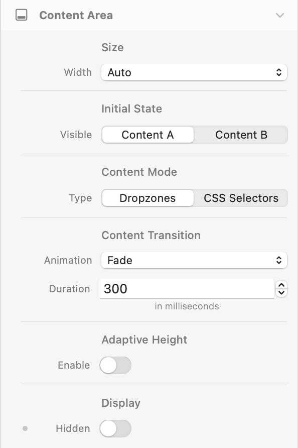
Content Area
Size
Width
- Description: Width of the content area inside the Toggler. Affects only the content panels (A and B), not the trigger or the wrapper.
- Options: Auto, Full, Screen, Breakpoint, Theme Spacing
- Default: Auto
- Notice: When set to Breakpoint, content is centered horizontally and constrained to the active breakpoint width. Theme Spacing uses a value from the theme's spacing scale.
Initial State
Visible
- Description: Which content is shown by default on page load (before any user interaction).
- Options: Content A, Content B
- Default: Content A
Content Mode
Type
- Description: Determines how content switching works.
- Options: Dropzones, CSS Selectors
- Default: Dropzones
Notices:
- Dropzones: Uses two internal content areas (A and B) where you can drag and drop components.
- CSS Selectors: Targets external elements on the page by CSS class or ID, applying style transitions between active/default states (opacity, scale, translate, blur, shadow, max-height).
Content Transition (Dropzones)
Animation
- Description: Transition animation when switching between Content A and Content B.
- Options: None, Fade, Slide (Horizontal), Slide (Vertical)
- Default: Fade
- Availability: Only when Content Mode is Dropzones
Duration
- Description: Duration of the content transition animation.
- Default: 300ms
- Range: 0 – 2000ms
Adaptive Height
- Description: Smoothly animates the container height when switching between content areas of different heights.
- Default: false (disabled)
- Availability: Only when Content Mode is Dropzones and Animation is not None
CSS Selectors
Content A / Content B
- Description: CSS selector targeting the external elements for each content state.
- Accepts: Any valid CSS selector (e.g.
.my-class,#my-id) - Availability: Only when Content Mode is CSS Selectors
Basic Styles (Default / Active)
- Description: Opacity and scale applied to target elements in the default (inactive) and active states.
- Defaults (Default): Opacity: 50%, Scale: 95%
- Defaults (Active): Opacity: 100%, Scale: 100%
Advanced Styles (Default / Active)
- Description: Additional transformation and effect properties applied to selector targets.
- Properties: Translate Y, Translate X, Blur, Shadow
- Defaults: All 0 (no effect)
- Availability: Only when Advanced Styles is enabled
Adaptive Max Height (Default / Active)
- Description: Animates the max-height CSS property of selector targets between states. Useful for collapsing/expanding content.
- Defaults: Default: 0px, Active: 1000px
- Range: 0 – 5000px
- Availability: Only when Content Mode is CSS Selectors and Adaptive Max Height is enabled
Display
Hidden
- Description: Hides the entire Content Area both in the editor preview and at runtime. The triggers remain visible. Use this to turn the Toggler into a controller-only component, paired with other Togglers (sharing the same Toggler ID) that hold the actual content.
- Use cases:
- A controller in a hero section that drives multiple synced “card” Togglers placed elsewhere on the page (e.g. pricing cards with only the price block inside each card).
- A small language switcher in a navbar that controls multiple content sections (about, testimonials, footer) across the page.
- Responsive layouts where the controller should appear in compact form on mobile but exposes its content area on desktop.
- Default: false (content area visible)
- Responsive: Yes — can hide the content area on specific breakpoints only.
- Pairs well with: Toggler ID (General) for syncing, and the Hidden switch under Trigger Settings → Display on the “card” Togglers (which hide their own triggers and only show their content).
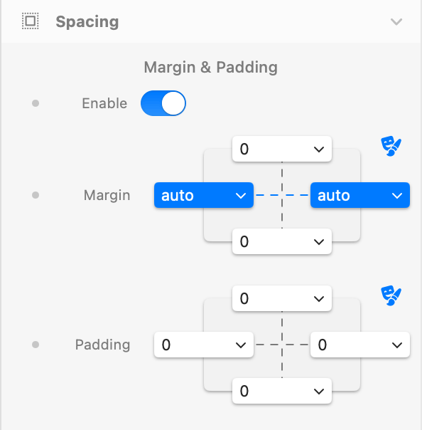
Spacing
Enable
- Description: Enables margin and padding controls for the Toggler container.
- Default: true (enabled)
Margin
- Description: Outer spacing using theme spacing values. Individual top, right, bottom, left values.
- Default: Top: 0, Right: auto, Bottom: 0, Left: auto (horizontally centered)
Padding
- Description: Inner spacing using theme spacing values. Individual top, right, bottom, left values.
- Default: 0 (all sides)
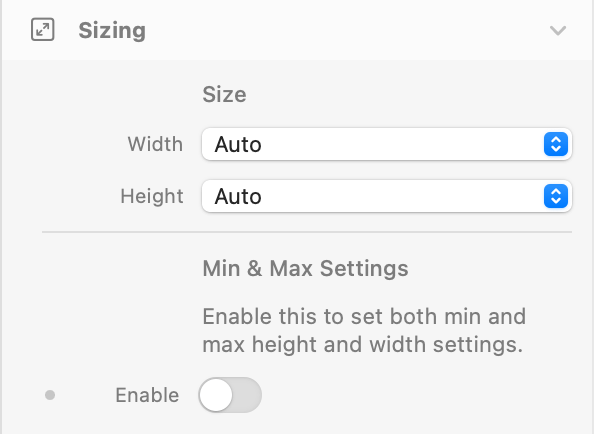
Sizing
Controls the dimensions of the entire Toggler wrapper as a whole (not the content panels — see Content Area → Size for those).
Size
Width
- Description: Width of the Toggler wrapper.
- Options: Auto, Full, Screen, Breakpoint, Theme Spacing
- Default: Auto
Height
- Description: Height of the Toggler wrapper.
- Options: Auto, Full, Screen, Theme
- Default: Auto
Min & Max Settings
Enable
- Description: Reveals separate Min/Max controls for both Width and Height (themeSpacing).
- Default: false (disabled)
Min / Max Width & Height
- Description: Constraints for Width and Height. Useful when Width or Height is set to Auto/Full/Screen but you want a floor or ceiling.
- Defaults: Min: 0, Max: auto
- Availability: Only when Min & Max Settings is enabled
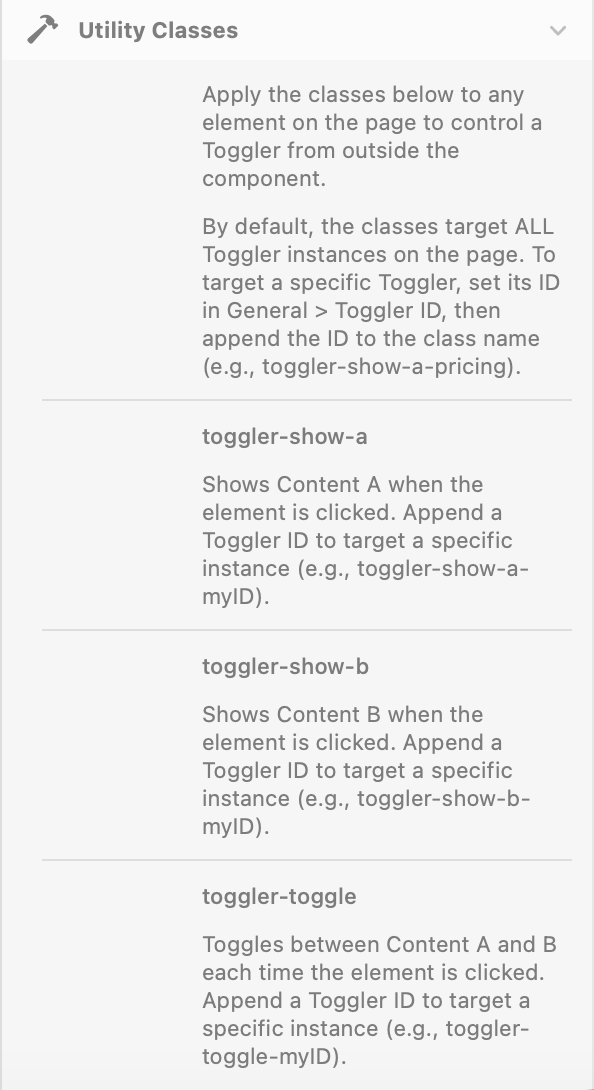
Utility Classes
Apply these CSS classes to any element on the page to control a Toggler from outside the component. By default, the classes target all Toggler instances on the page.
To target a specific Toggler, set its Toggler ID in General → Toggler ID, then append the ID to the class name (e.g. toggler-show-a-pricing targets only the Toggler with ID pricing).
toggler-show-a
- Description: Shows Content A when the element is clicked.
- Target specific: append a Toggler ID, e.g.
toggler-show-a-myID
toggler-show-b
- Description: Shows Content B when the element is clicked.
- Target specific: append a Toggler ID, e.g.
toggler-show-b-myID
toggler-toggle
- Description: Toggles between Content A and B each time the element is clicked.
- Target specific: append a Toggler ID, e.g.
toggler-toggle-myID